Word Choices and Language in UX, Part Three: User Interface Labels & Messages
On November 28, I gave a presentation to UX Winnipeg on the impact of word choices and language on the user experience, and how we can create better user experiences through the better use of language.
- Part One: Introduction & the Meaty Bits
- Part Two: Word Choices and Language in Information Architecture & Personas
- Part Three: Word Choices and Language in User Interface Labels & Messages

Language in user interfaces
In Part Two, we looked at how we can make deliberate choices about word choices and language — and why it’s important — as part of user experience strategy and processes.
Now, let’s explore something a bit more tangible: word choices and language in user interfaces.
Before we get started, it’s important to understand the difference between “labels” and “messages.”
Labels are used by users to understand their environment.
Messages are used by the product to communicate with its users.
It’s a subtle but important distinction.
Labels
Labels make your information architecture tangible and actionable for your users. They help users understand:
- Their place within their environment.
- How things are organized within their environment.
- What actions they can take.
Here’s how we can deliberately choose words and language that make for better labels:
1. Use the language you already defined
You did the research, you tested it along the way, and you made language frameworks to help your team develop a shared vocabulary. Now, use those words in your interface labels.
2. Use the user’s vocabulary
When you need to come up with new labels, make sure you’re using the user’s vocabulary. Watch out for business or technical jargon. Like glitter, it appears out of nowhere and gets stuck.
3. Keep it simple
Our users are satisficing. They’re not going to read every word. Keep your labels simple. When only one word is necessary, use only one word.
4. Use labels that imply outcomes
When labeling elements that users can interact with, use labels that imply outcomes. This makes it easier for users to predict what will happen when they interact with the element.
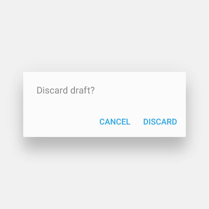
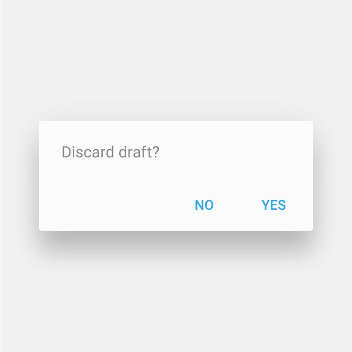
The following example from the Material Design Guidelines is a perfect example: on the left, “Discard” and “Cancel” imply an outcome following user interaction, while on the right, “Yes” and “No” offer no help at all.


5. Use real labels in prototypes and testing
Use real labels during prototyping and user testing — not lorem ipsum. A prototype that doesn’t use real labels is useless: you aren’t testing effective design solutions, you’re testing wireframe illustrations.
During testing, see if you can identify words that are inconsistent with what the user states they’re looking for or interacting with.
Messages
Messages are a little more complicated than labels. Users lean on messages during their Perception-Action Loop as they cycle between “What’s going on?” and “What do I do next?”
The tricky thing about messages is that users don’t read them.
Usability tests show over and over that users tend to skim or skip messages altogether. Experienced users tend to skip messages like instructions, because they assume they know what they’re doing. Beginners are juggling a tremendous amount of information in their mind and feeling overwhelmed, and hoping things will be okay if they go with it. Even when users do read messages, poorly written messages can make things more confusing than they were at first (Spolsky).
Here’s how we can deliberately use word choices and language to make more effective messages:
1. Consider how context affects how the message is perceived
A user’s unique context influences not only whether they see a message, but how they perceive, interpret, and act on it.
Users see modals not as important information for them to read, but as “things preventing me from getting my work done until I get rid of them.” They’ll often just close modals without reading them.
A user’s own context and experience can influence how a message is perceived, and what action they take. Consider this wonderful example from Joel Spolsky, whose friend kept hitting “no” on a confirmation modal when they were trying to exit the application:

“The very fact that Juno was questioning her choice made her immediately assume that she was doing something wrong. Usually, when programs ask you to confirm a command, it’s because you’re about to do something which you might regret.” — Joel Spolsky
This brings us to our next method:
2. Skip the message
Consider whether the user actually needs to know, or make a choice, about something.
We’re living in an amazing age of technology. The more steps we can remove for our users, the better our user experience will be — and we can skip the messy business of getting our users to read our messages at all.
3. Use messages to provide useful feedback
Make sure any message you use is providing immediate and useful feedback to the user. Remember, they’re using your message to help them cycle between “What’s going on?” and “What do I do next?”
Edit your messages so that it’s clear what’s going on, and what the user can or should do about it.
4. Use the user’s language
Again, avoid technical or business jargon. Like sand, it’s coarse and rough and irritating and gets in everywhere.
5. Tailor the tone of voice
Most of us aren’t copywriters, so the prospect of writing or editing messages can feel overwhelming. Nielsen Norman Group identified four dimensions of tone that we can use as a framework for writing effective messages:
- Funny v.s. Serious
- Formal v.s. Casual
- Respectful v.s. Irreverent
- Enthusiastic v.s. Matter of Fact
By being aware of these dimensions and tailoring the balance between each one for both the user’s context and your brand personality, you can write better, more effective messages.
6. Use personal pronouns
Using personal pronouns in our messages makes them easier for users to process and relate to. Consider the following example:
“Qualification criteria includes having completed modules I and II.”
↓
“You must complete modules I and II to qualify.”
7. Use verbs instead of verb-noun phrases
A handy technique for simplifying messages and making them less “businessy” is to look for combinations of verbs and nouns that can be replaced by a single verb. For example:
“Make an application today”
“Apply today”
Another example:
“We will provide a refund for your donation”
“We will refund your donation”
8. Put action before outcome
Generally speaking, it’s a good idea to put the action that the user should take before the outcome that will occur. For example:
- “Reply by double-tapping” v.s. “Double-tap to reply”
- “Learn a language together by teaming up with friends.” v.s. “Team up with friends to learn a language together.”
This approach makes it easier for users to visualize cause and effect: the action they can take, and the outcome they can anticipate.
9. Connect labels to messages with shared or similar words
Most messages are shown together with some kind of label — likely on an element the user can interact with, like a button. When this is the case, deliberately connect the message and the label by using the same, or similar, words. This helps the users connect “What’s going on?” with “What do I do next?”
Google’s Material Design Guidelines continue to be an excellent example: the word “Discard” is shared across both the message and the label.


We’ve explored how word choices and language affect the user experience, and how we can make better use of words and language to create a better experience.
In Part One, we looked at how our users are making their way around their world, and how words are really powerful symbols. In Part Two, we explored how to make use words and language to define our information architecture and create better personas. Finally, in Part Three, we looked at how to use words and language to make better labels and messages in our user interfaces.
It all comes back to one thing: make deliberate choices about the words and language you use. You’ll create a better user experience.
Thanks for hitting the 👏 if you enjoyed this article!
Quinn Keast is a UX Designer + Partner at Caribou, a user experience strategy and design consultancy in Winnipeg.
